Innovative Medical Products (IMP), a global leader in medical positioning devices, sought to revamp their brand with the goal of creating a distinctive and compelling identity that would connect with their customers and employees on a deeper level. Along with updating their visual aesthetics for improved brand recognition, they also aimed to enhance their ability to effectively communicate their core mission and services to the orthopedic professionals.
To kick off the brand refresh, we conducted a comprehensive audit of their current branding, as well as several discovery sessions where we interviewed internal stakeholders and customers to learn about the history of their brand and why it exists. We also conducted a thorough analysis of IMP's closest competitors, which allowed us to identify gaps in the market to differentiate the new IMP brand from its rivals.
Our findings revealed that their existing color palette and logo were outdated, and did not adequately convey its core values of support, helpfulness, and innovation in any of its brand communications. A more contemporary and refined look was needed in order to convey how technologically advanced the company is and how innovative the products they manufacture are.
We also discovered that the competitive landscape lacked dynamic photography and websites that were optimized for lead generation. This provided us with a unique opportunity to develop a strategy and approach that would help IMP stand out and establish itself as a market leader.
Overskies embarked upon a complete overhaul of the brand, positioning IMP as market leaders in the orthopedic community.
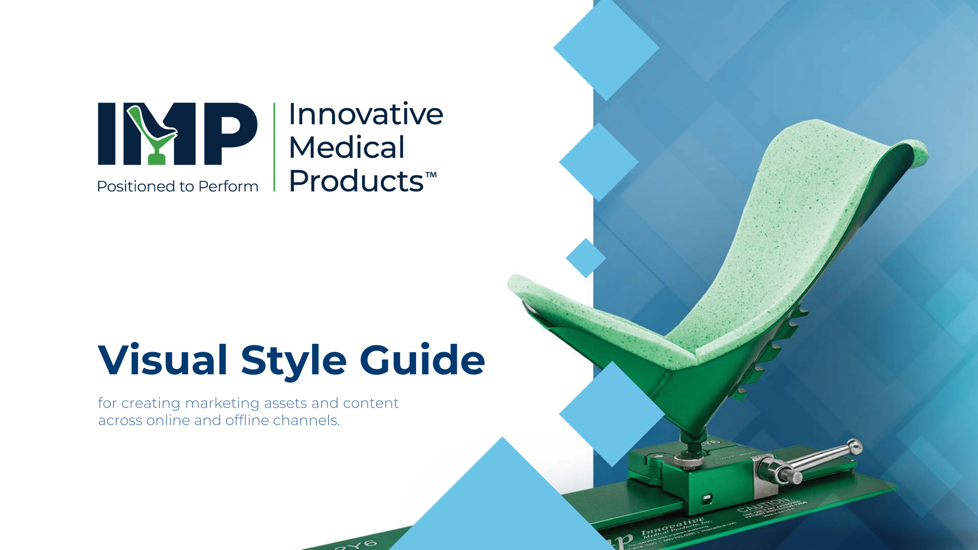
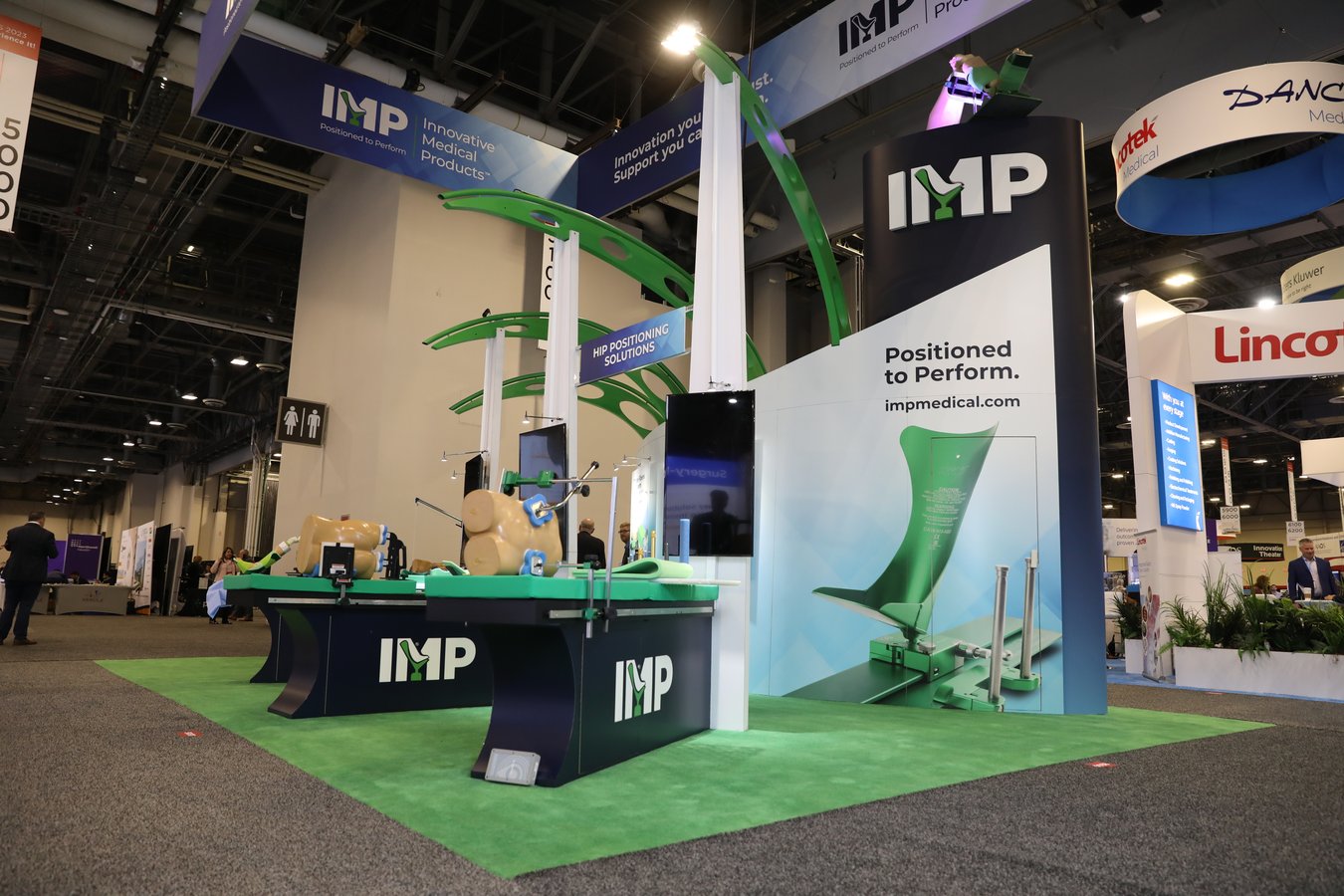
Our initial focus was their overall positioning, as well as their logo. The concise and memorable tagline, "Positioned to Perform", effectively conveyed their core mission and service. To further carve out a market niche and differentiate the brand, the logo took on a much more contemporary design that incorporated their top-selling knee positioning device. This device contributes to 80% of their yearly income and was a crucial element to showcase. This new brand identity established a distinct brand personality for IMP, and clearly differentiated them within the market.
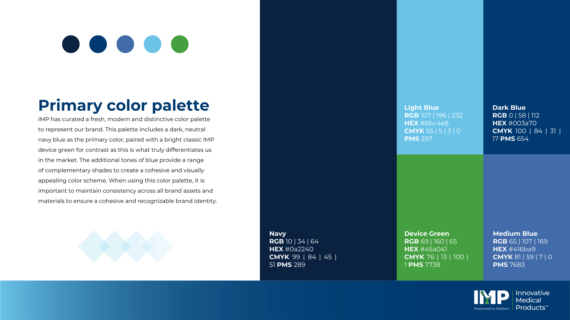
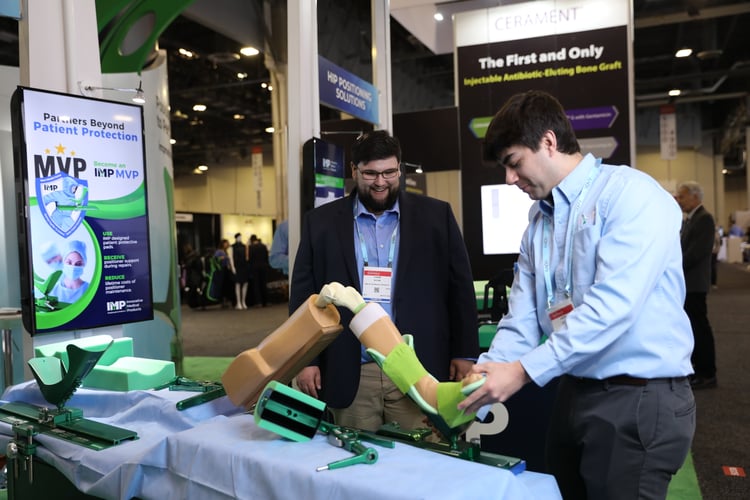
Next, we curated a unique color palette that incorporated a primary color of deep, neutral navy blue, complemented by a vibrant green. We chose this green shade as it mimics the color of their top-selling knee positioning device, which sets them apart from competitors and is a defining characteristic of their brand.
We also introduced a secondary palette of complementary colors that serve as accents and are primarily used as indicators for calls-to-action, highlighting essential information or drawing attention to specific details in their materials.
We also modernized their font, opting for a cleaner and more dynamic typeface that would facilitate clearer communication and ensure consistency across all platforms and materials.
And finally, to further enhance their brand identity, we created a distinct background pattern as well as a library of icons further reinforcing their unique and recognizable brand image.
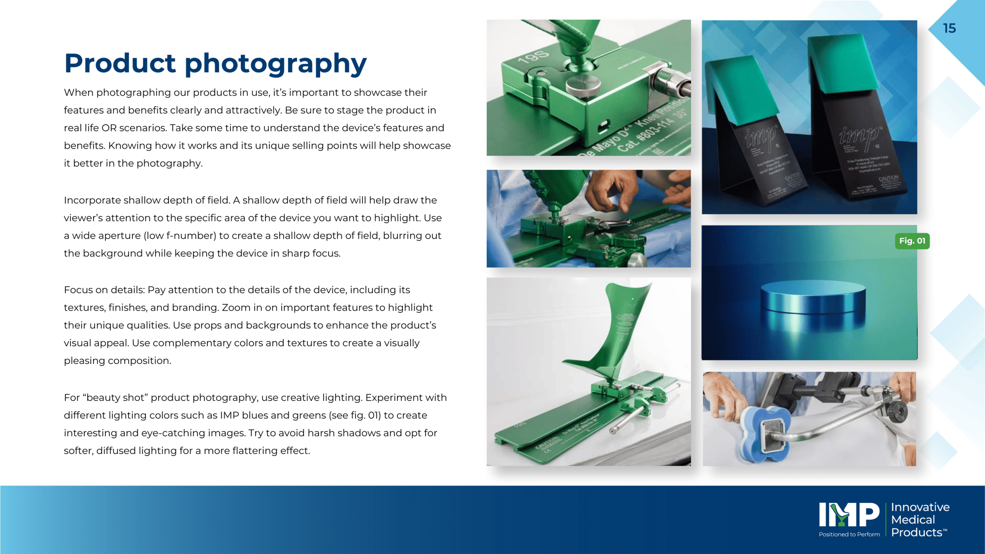
After the new positioning, logo, color palette, font, and graphic elements were established, Overskies created a comprehensive set of brand guidelines, which was a first for IMP. This Style Guide served as the definitive resource for producing marketing and content assets across various online and offline channels, ensuring a consistent and cohesive brand image across all materials.

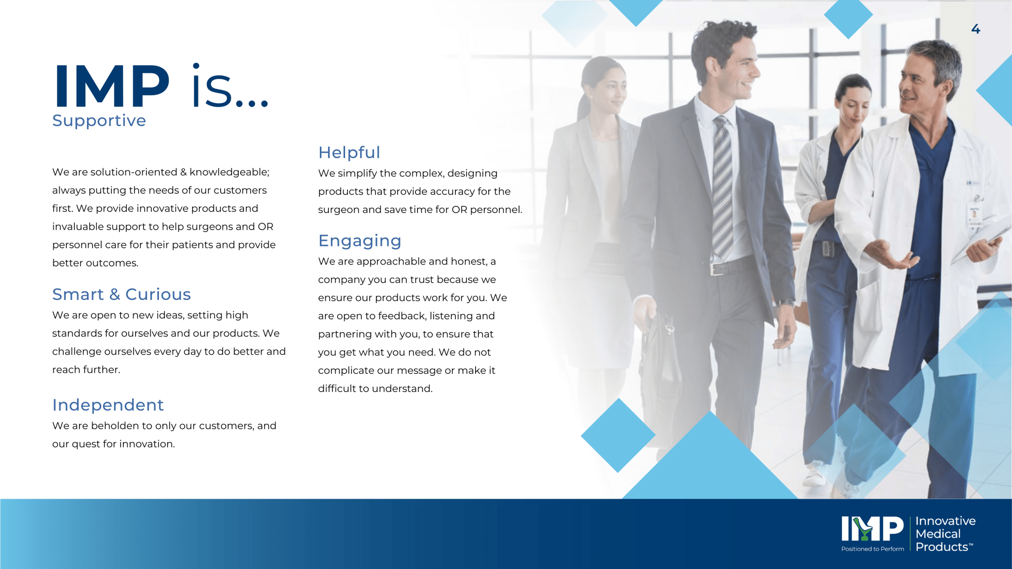
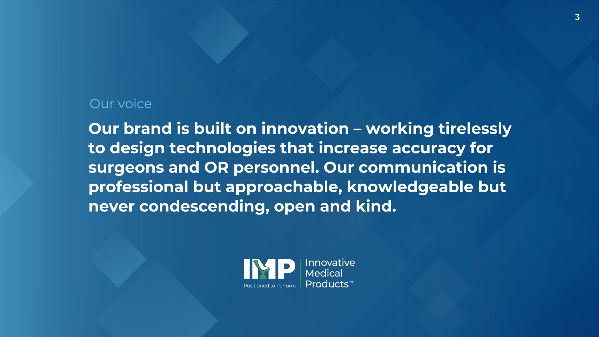
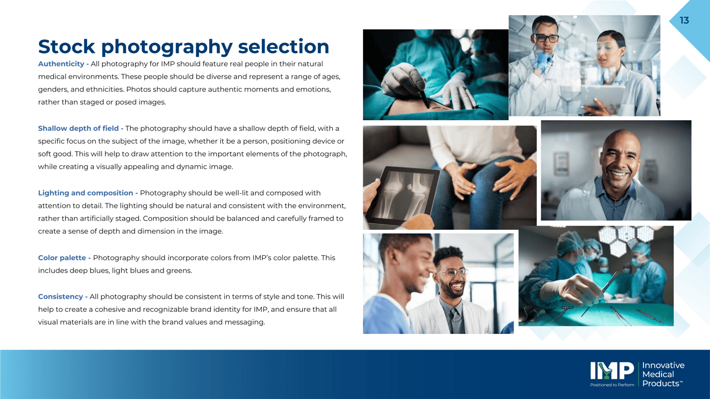
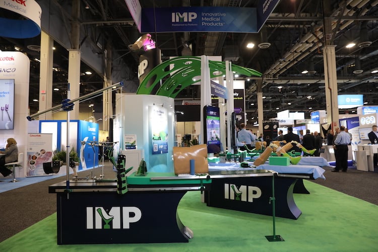
At the American Academy of Orthopaedic Surgeons meeting (AAOS) in Las Vegas, IMP unveiled their revamped brand, showcasing their bold and contemporary design, updated color palette, and refreshed tagline. The brand's updated booth was a huge hit both internally, as well as with customers and industry influencers.
In year one of the rebrand IMP has seen an 8% increase in sales YoY and a 4% increase in brand perception. 2023 also marked the largest single year in overall sales for the company.
The reinvigorated brand image will now be implemented across all brand channels, including a redesigned website that will feature new and improved functionalities to enhance the overall customer experience.
With the orthopedic healthcare industry on an always-evolving course, IMP is aiming to reflect these advancements both internally and externally.

Mark O’Marketing
VP Sales & Marketing, Xappp